A digital product to be successful on the market must meet the expectations of end users. Your potential customers browse the web on a variety of devices and expect to be able to use them anytime, anywhere. It is in your interest that the design of the application or website always looks perfect, regardless of whether the recipient opens it on their smartphone, tablet or laptop. Responsive and adaptive design are two different paths that you can follow when creating your website. Find out which one is best for your business?
Consumers’ habits today are very different from those of the 1990s. We used to use the web mainly on a computer, but now about 60% of the population uses smartphones when surfing the Internet. If you want to ensure a positive user experience, modern websites must display equally well on a large laptop screens and smaller displays of mobile devices. This is important not only visually, but also technically and in terms of marketing.
The “mobile first” trend has become clear in recent years. Google places a lot of emphasis on it, positioning mobile user-friendly websites much higher in the search engine. If the website is to work properly on a smartphone, tablet, desktop computer or other device, it should be properly designed. Two approaches can be used when creating websites: responsive or adaptive.
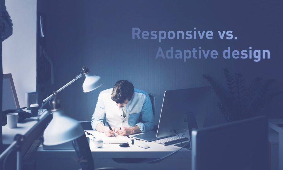
Responsive vs adaptive design
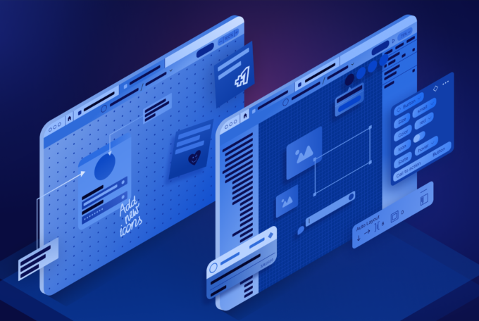
Every website designer should create it in such a way that it displays correctly on any device, regardless of the screen resolution. Matching the website to a computer or smartphone can be achieved in two different ways. The first is the use of responsive design, the second is adaptive web design. The main difference is in the way interface elements are displayed on the target end-user screen, service performance, loading speed. These are the key factors influencing User Experience.
Responsive design
Responsive design makes the website adjust itself to the screen resolution. Responsive websites smoothly change the size and placement of interface elements. A responsive website uses CSS media queries, queries the browser for the current window size and adjusts the page dimensions in real time. Elements on a responsive website are typically described as a percentage of the width or height of the screen on which the page is currently displayed.
The navigation of responsive websites (RWD) changes on mobile devices in such a way as to make navigating them easier for the user, even if they have a very small screen. In practice, this means that fonts or graphics change their size, and some functionalities of the website may look different (for example, the standard menu appearance may be replaced by a “hamburger” ≡ typical for mobile websites).
The main advantages of designing responsive websites:
- RWD (Responsive Web Design) are noticeably cheaper to maintain.
- Responsive approach is rewarded by web browsers.
- There are tools available on the market that make creating RWD pages much faster and easier than adaptive ones.
- Responsive websites are easier to manage and modernize.
Disadvantages of RWD design:
- Contrary to what it seems, it takes much more time to create them. The front end developer, graphic designer or UX designer who creates it must have much greater knowledge and skills, and this translates into the amount of investment.
- The design of a responsive website adapts to the screen resolution, but it does not give the creator full control over its final appearance on all devices.
- A responsive website takes much longer to load than an adaptive one (information about the website is contained in one file, which, regardless of the size of the device, must be fully loaded).
- Older browsers (e.g. Internet Explorer 6) do not support responsive technology.
Adaptive design
Adaptive design uses a static layout. It is actually a few page templates prepared by the designer in various dimensions, which are “swapped” when the page recognizes a different resolution (they require refreshing the page or entering the main page that will recognize the size of the window).
Web designers dealing with adaptive design usually create 6 versions of the website for the most popular device widths, i.e. 320, 480, 760, 960, 1200 and 1600 pixels. Non-standard screen sizes will, however, display the version of the page with the dimensions closest to them.
Advantages of Adaptive Web Design:
- A properly designed adaptive website ensures more comfortable use for mobile Internet users.
- Adaptive websites load much faster than RWD (loading speed can make a big difference to your business. Over 50% of mobile users admitted abandoning pages if they take longer than 3 seconds to load).
- Creating an adaptive website is usually much cheaper than designing a responsive website.
Disadvantages of adaptive web design:
- A big problem for adaptive websites is manual reduction or expansion of the browser windows by the user – without a dedicated template, they will not adapt to the resolution.
- If your website users use many devices with non-standard display dimensions (there are more and more smartwear devices on the market, for example), creating multiple versions of websites can incur much higher costs than with RWD.
- Any changes and modernization of the website must be properly carried out in each version. This translates into higher costs of maintaining adaptive websites.

Responsive or adaptive page?
There is no definite answer to the question which path of creating a website is better. With new projects, it is worth considering a responsive approach, and if you are modernizing an existing website – an adaptive approach. Much depends on your individual needs.
Each route requires the necessary knowledge, experience and time for production, testing and implementation. In order to best match website design to your business, first you should get to know the needs, expectations and habits of your potential users. The amount of budget you have at your disposal for the implementation, modernization and further maintenance of the website is also important.
If you need support and are looking for a partner who will provide you with reliable advice on which website development technology will be better for your business, contact Stepwise. Our specialists always treat your business needs as a priority, so they will offer you proven and innovative solutions that will help you succeed.